
self portrait 001 - #2
Full view on hover (tap for mobile), or see end of post
Thoughts
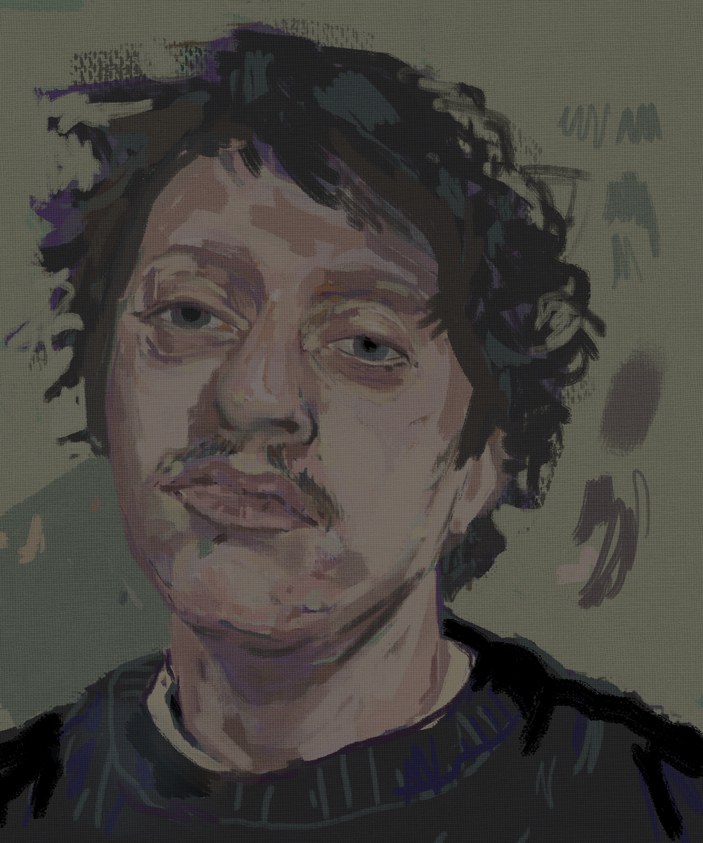
Here is an update to a self portrait I started yesterday.
Managed to get some really nice rendering in, warmed up the colors to put some blood back under my skin, and fixed the more glaring issues with the facial feature proportions/positions.
Quite pleased with the top of the nose especially. It was one of those weird coincidental brushstrokes that I did without a second thought; once I "stepped back" (zoomed out) and saw how much depth and dimension it added, I was awestruck.
Process
For the rendering of the nose I switched between Hard Edge Textured Block and Bristle Thick Textured from David Revoy's 2023 brush pack. I laid down the basic shapes in pink/red/cream with the Hard Edge brush then went over it with the Bristle Thick brush, which offers pressurized (AKA controllable) opacity, in turquoise.
The green melded1 nicely with the skin tone, but the blue pushed things back2 enough to created a shadow that brought a sense of depth, overlap, and dimension.
I hated this painting when I left it yesterday, but I'm really happy with what I churned out today, and in only 40 minutes no less!
Reflection
I was pretty depressed today and yesterday. Both days were largely unproductive. I wasn't able to do as much housework as I wanted, and whenever I tried to write my brain just got all twisted up and tangled.
Painting is nice in that I reach a sort of flow state. I'm really glad to get back into it again. Being able to just hone in and focus and reach that level of zen was exactly what I needed tonight.
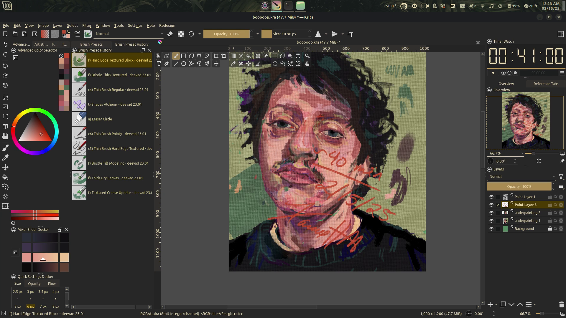
I've been taking videos of my painting sessions but I can't figure out Snapshot for the life of me. Once I learn how to speed up the playback I'll post them to my Makertube account and embed them in my posts.
For now, here's a screenshot with my date and signature from today's video.
Take care. <3
Full Size
✘ Posted on — 02/15/25
✘ Last modified — 3 months ago
✘ Link — https://blog.xavierhm.com/self-portrait-001-2
Footnotes
Green is red's complimentary color, and is often used to desaturate warm tones to create a granular, realistic skin tone; by using a greener blue, it didn't just sit on top of the nose as a flat value, but melted into the skin↩
Cool colors appear "further away" from the eye than warm colors, which feel closer to the viewer↩