
Table of Contents Debugging: A Lesson in Brute-forcing CSS — Part One
Table of Contents
1.
I've been having a bug on my table of contents that I built where the list exceeds the bounds of the body of my blog, as well as the border I created, when viewed on mobile. I'm going to try to debug it here. I'll be adding filler text because I tend to title each number with a small preview/summary of the contents of each section. I'm going to use screenshots to display each iteration as I work through the code.
Disclaimer: I've never studied CSS or HTML or any coding formally. I'm just figuring things out as I go along! All I really do is copy & paste then brute force edits until something looks how I want it to haha. This is my first attempt at sitting down and working through code in a methodical way. I have definitely used the wrong terms/syntax, etc, so please bear with me. I'm just posting this for my own documentation purposes, not educational ones.
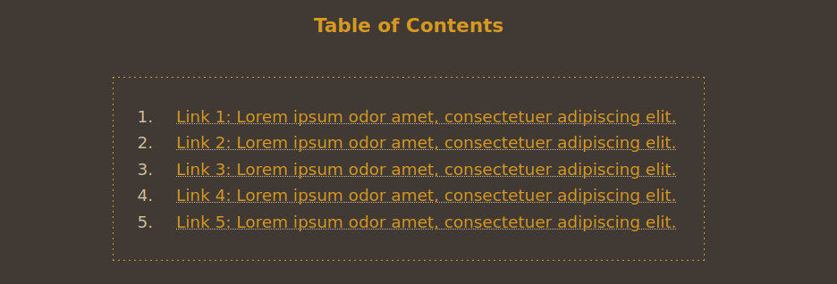
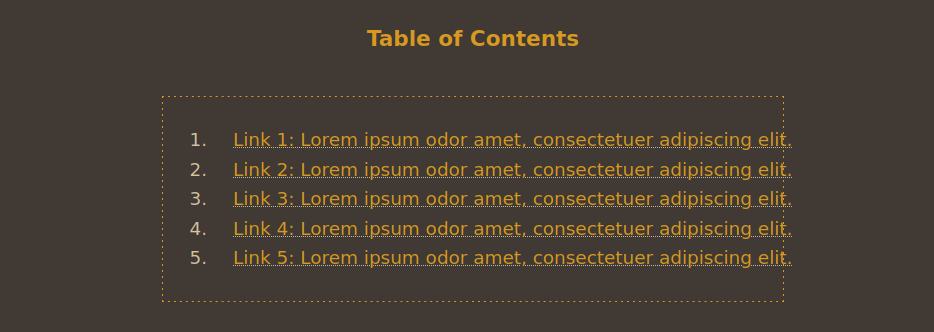
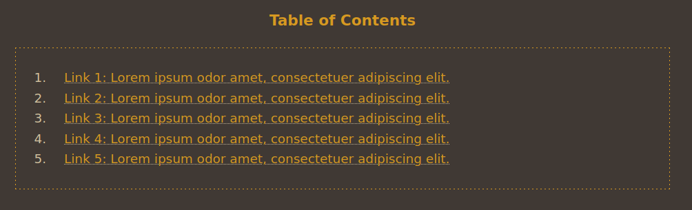
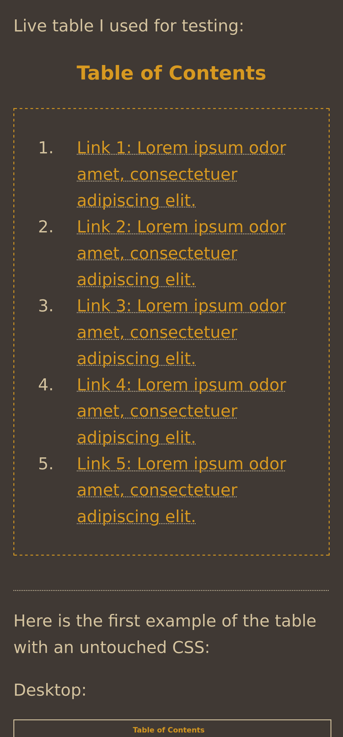
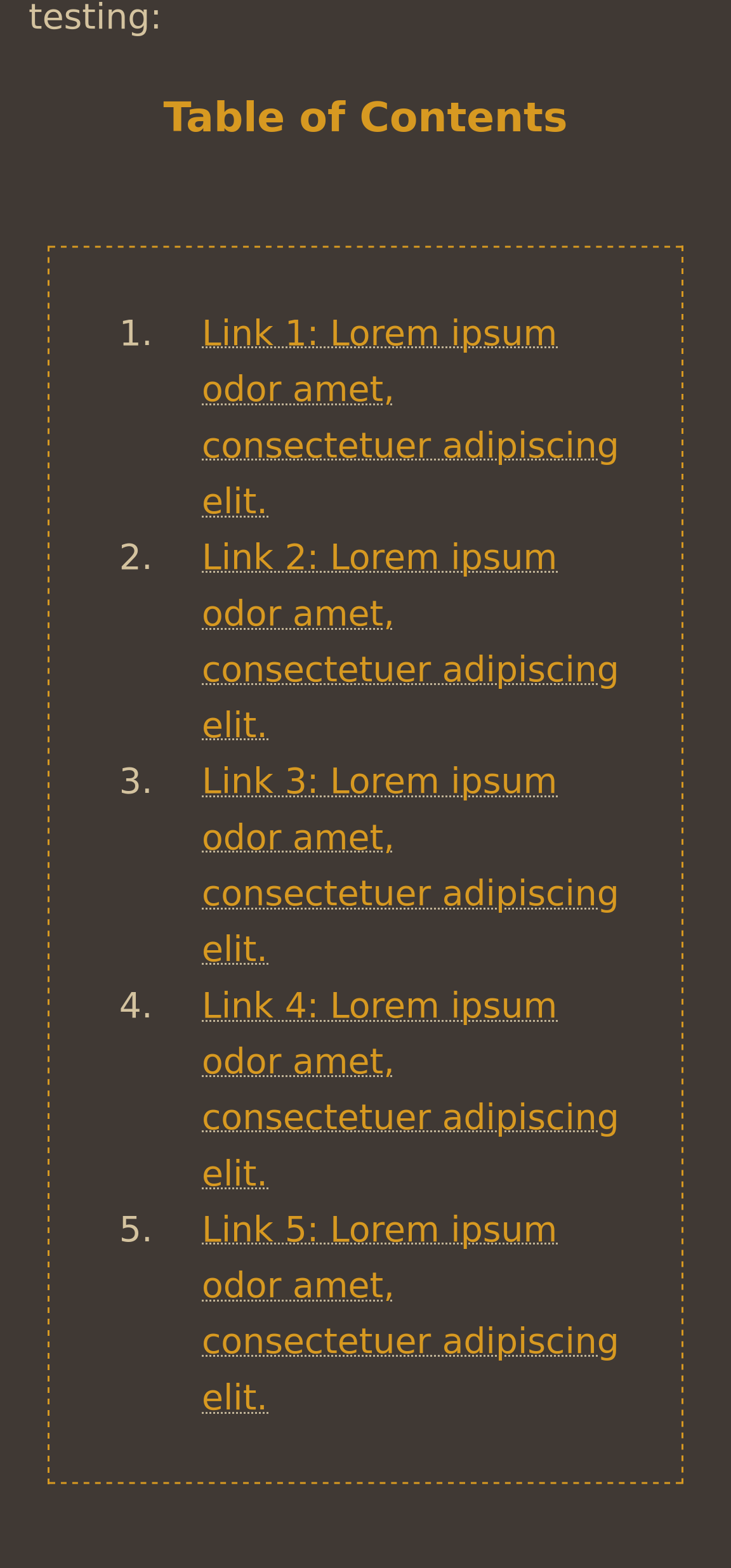
Live table of contents I used for testing:
Table of Contents
- Link 1: Lorem ipsum odor amet, consectetuer adipiscing elit.
- Link 2: Lorem ipsum odor amet, consectetuer adipiscing elit.
- Link 3: Lorem ipsum odor amet, consectetuer adipiscing elit.
- Link 4: Lorem ipsum odor amet, consectetuer adipiscing elit.
- Link 5: Lorem ipsum odor amet, consectetuer adipiscing elit.
2.
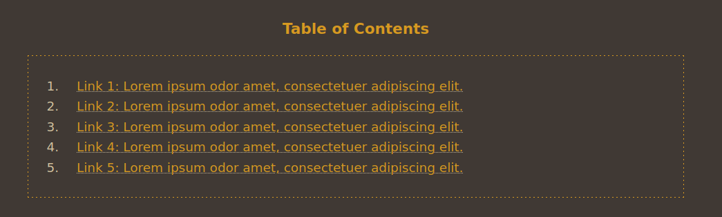
Here is the first example of the table with an untouched CSS:
Desktop:
Mobile (as seen in Firefox's Responsive Design Mode):
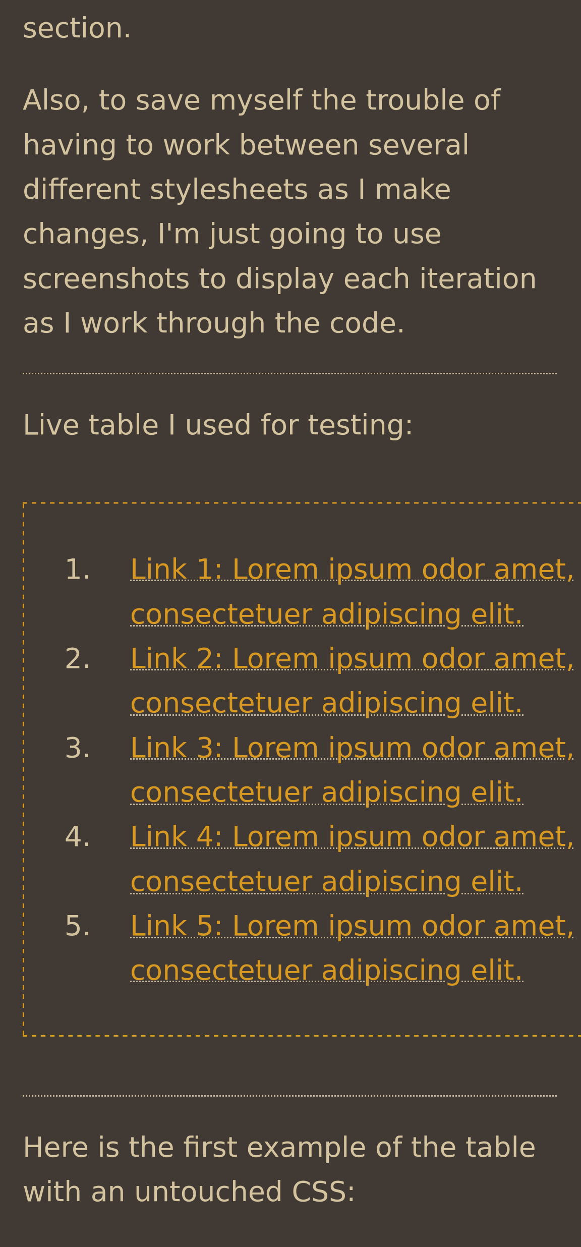
As you can see, the rightmost boundaries of the table go off-screen.
Here is the initial code for the HTML (this doesn't need changing):
<center><div class="tableofcontents">

<ol>

<li><a href="#1">Link 1</a></li>

<li><a href="#2">Link 2</a></li>

<li><a href="#3">Link 3</a></li>

<li><a href="#4">Link 4</a></li>

<li><a href="#5">Link 5</a></li>

</ol>

</div></center>
Here is the initial code for the CSS file:
/* Table of Contents */

.tableofcontents {

border: 1px dashed var(--text-color);
margin-top: 1em;
object-position: center;
padding: 10px;
margin-right: auto;
margin-left: auto;
display: inline-block;
text-align: left;
max-width: 100%;
.tableofcontents ol {

color: var(--text-color);
max-width: 100%;
width: 600px;
padding-left: auto;
padding-right: auto;
}


.tableofcontents li {

padding-left: 20px;
margin-left: auto;
margin-right: auto;
max-width: 100%
}
3.
I tried offsetting the width: 600px attribute, which sets how large the list and and its contents are, with max-width: 100%; which makes it so that the list doesn't exceed the boundaries of its parent container; i.e., the width of a phone screen.
In reviewing the code now, I realize I didn't set width: 600px on either .tableofcontents or .li; I think while fiddling around with it initially, that might have bugged something up. I'll give it another go now and add that line of code to each section.
Changes:
/* Table of Contents */

.tableofcontents {

border: 1px dashed var(--text-color);
margin-top: 1em;
object-position: center;
padding: 10px;
margin-right: auto;
margin-left: auto;
display: inline-block;
text-align: left;
max-width: 100%;
width: 600px;
.tableofcontents ol {

color: var(--text-color);
max-width: 100%;
width: 600px;
padding-left: auto;
padding-right: auto;
}


.tableofcontents li {

padding-left: 20px;
margin-left: auto;
margin-right: auto;
max-width: 100%
width: 600px;
}
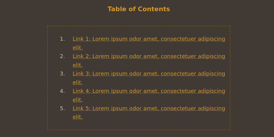
Here is the table on Desktop after these changes were applied (Mobile remained visually unchanged):
Now it looks even buggier! Lol.
4.
I decided to reduce the pixels in <li> so that they wouldn't overrun the boundaries of the div and ol elements.
Changes:
.tableofcontents li {

padding-left: 20px;
margin-left: auto;
margin-right: auto;
max-width: 100%
width: 550px;
}
But all this accomplished was limiting the width of the list contents, and didn't serve any purpose as far as the mobile width goes.
5.
Back to square one. It's now occurred to me that maybe the problem isn't with the list, but how the table behaves as a whole. This would be a problem on the <div> level, so I decided to take another look at the root .tableofcontents code and removed the changes I made to <ol> and <li>.
My first hunch was that perhaps either the margin or display properties were giving me grief, since they determine where the table sits in relation to the space around it.
The easiest thing would be to change the display property, so I did just that.
.tableofcontents {

border: 1px dashed var(--text-color);
margin-top: 1em;
object-position: center;
padding: 10px;
margin-right: auto;
margin-left: auto;
display: block;
text-align: left;
max-width: 100%;
As I expected, the margin properties no longer worked. display: inline-block follows margins. I just thought on the off chance it might fix something, I'd go ahead and try it.
Then I remembered the flex display attribute, so I went ahead and tried that as well:
.tableofcontents {

border: 1px dashed var(--text-color);
margin-top: 1em;
object-position: center;
padding: 10px;
margin-right: auto;
margin-left: auto;
display: flex;
text-align: left;
max-width: 100%;
Mobile width is now contained in the screen boundaries! But the desktop text isn't centered anymore...
6.
I don't have images for this last bit, because by then I was so fed up I was just going back and forth between my text editor and Bearblog preview to see what worked until I finally managed to fix it.
I accomplished this by doing two things:
- Moving the border to the
olsection - Playing around with the padding of the list until everything fit into place
Here is the final code, with the final fixes emphasized:
/* Table of Contents */

.tableofcontents {

margin-top: 1em;
object-position: center;
padding: 10px;
margin-right: auto;
margin-left: auto;
display: flex;
text-align: left;
max-width: 100%;
.tableofcontents ol {

border: 1px dashed var(--text-color);
color: var(--text-color);
max-width: 100%;
width: 600px;
margin-left: auto;
margin-right: auto;
padding-left: 60px;
padding-right: 30px;
padding-top: 30px;
padding-bottom: 30px;
}


.tableofcontents li {

padding-left: 20px;
margin-left: auto;
margin-right: auto;
max-width: 100%
}
Here are screenshots of the finished product on desktop and mobile:
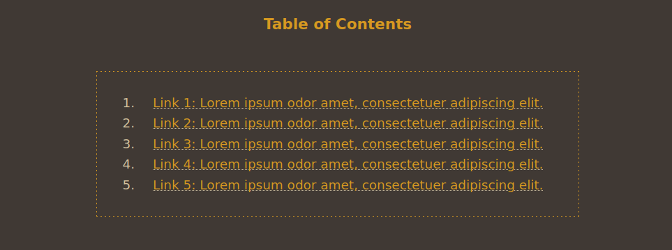
I'm really pleased with the results! I think it looks so nice and organized now, even better than the initial unmodified code. It's all uniform.
7.
Clearly, I have no idea what the hell I'm actually doing, or why the fixes...fixed things. I was just throwing anything I could against the wall and seeing what stuck. I'm sure a lot of it is redundant/unnecessary and needs some tidying up, but hey—if it ain't broke, don't fix it.
Here are three questions I took away from this:
- What are the distinctions between
<div>,<ol>, and<li>? - Why did moving the border to the
<ol>section of the CSS help, even though it visually looked the same when it was in the<div>code? - What is the
flexdisplay attribute, and why does it work on mobile wheninline-blockdidn't?
I'll do some studying/research and make a follow up post with what I find!
✘ Posted on — 12/23/24
✘ Last modified — 9 months, 1 week ago
✘ Link — https://blog.xavierhm.com/table-of-contents-debugging