
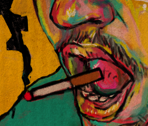
smoke break self portrait WIP, stages #0-2
Thoughts
Wanted to do something a bit more loose and graphical than my previous self portrait which I may or may not finish.
That portrait was very painterly. I wanted to try something that had the look of the dry mediums I used to love, like chalk pastels, ink, and colored pencil; I wanted everything to culminate into a kinetic drawing.1
I started this piece last night when I was feening for a cigarette. "Finished" it before work today.
I came back home after work and it kept gnawing at me, so I opened it up to work on it again; here we are about two hours later. This time I know I'm not done yet, lol.
Down below you'll find three WIP images. I didn't have an image from super early on, so I just removed layers until I got to the undersketch.2
Process
Drawn in Krita, mostly using the default Sketch brushes. The marigold yellow/hot magenta/bright teal is a color scheme directly lifted from when I used to go ham with chalk pastels and spray paint. I wanted to create a similar affect here.3
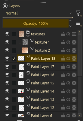
I always like to use textures in Krita so the canvas has "teeth" to it. For this one I paired the default paper texture in Krita with a random water stain texture I pulled off the internet. Set both to individual multiply layers in a multiply group.
For a majority of the process I only switched between the Pencil-3 Large 4B brush and Dry Roller brush.
Dry Roller brush
I used this on multiply/overlay layers at different points to get some cool layered effects with the colors, values, and brush textures.
Eventually started doing some passes of blue in an overlay layer to develop better form and shadows, similar to how I used blue/green tones on this self portrait to add some shadows to the tip of my nose, just on a more intense and graphic4 level.
Pencil-3 Large 4B brush
Used this for line work, sketching, etc.
About mid-way through Stage 1, I started using it to block in colors and shading. Using a smaller brush to fill in large areas makes for a scribbled/granular effect. You can see little gaps between the marks. Look at the smoke in Stage 1 to see what I mean.
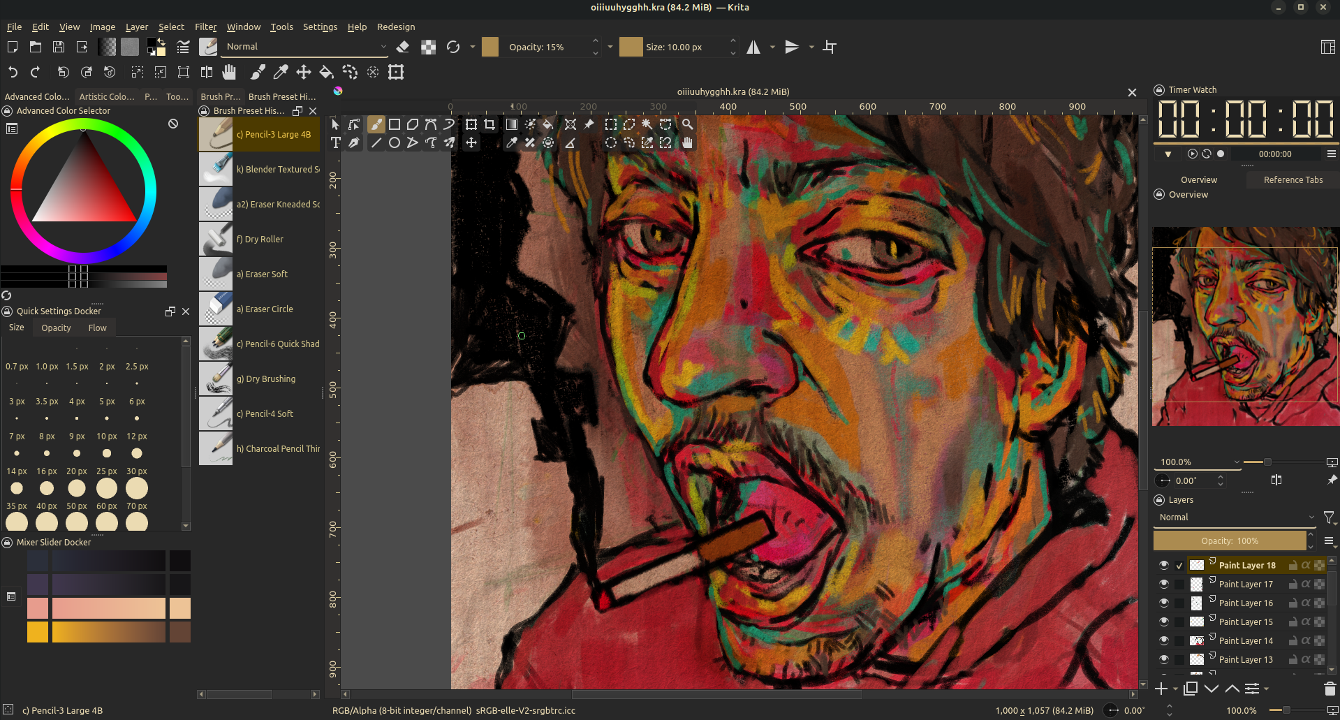
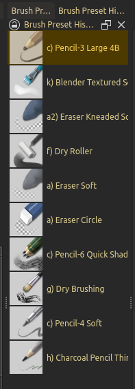
Brushes and texture layers
Here's two screenshots showing my brushes5 and texture layers setup:
Progress Pictures
Stage 0
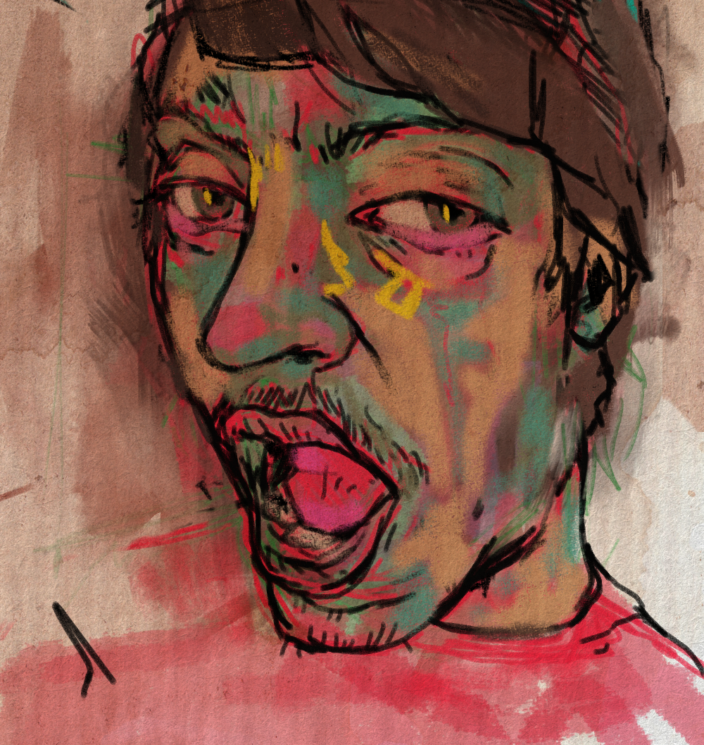
This is the closest I can get to an early progress picture. I used a reference image of myself that I took sometime last year. I had been crying about something and thought it would be good to record how my face looked.6 I opened my mouth because I thought it would be fun visually.
My hair was long at the time, so it covered up a good portion of my jaw, ear, shoulders, etc, which I just sort of guessed at.
You can see a normal-ish skintone amidst the blue and hot pink. I just put those down for flavor while I was figuring things out; I always find myself attempting to draw/paint "like normal" but inevitably get too excited and go off the rails.
Stage 1
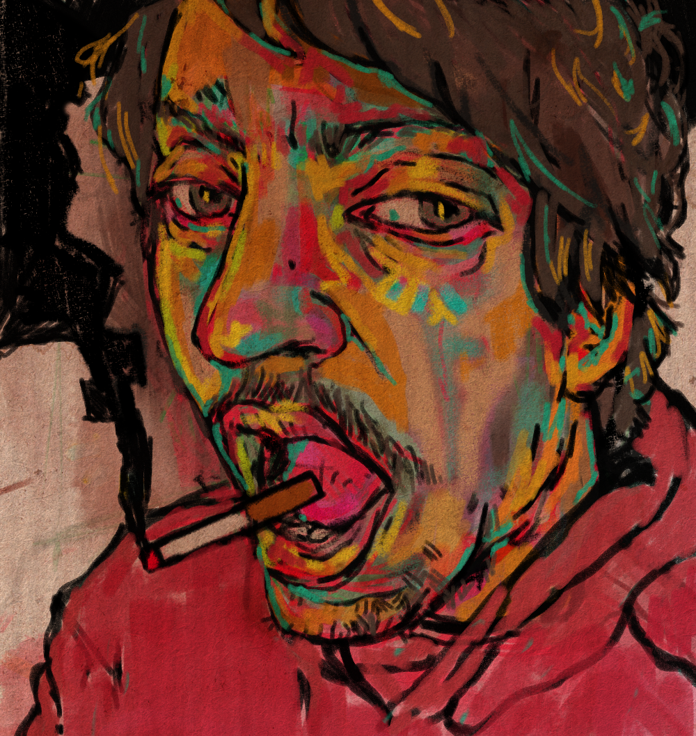
This is how things looked before I went to work, AKA when I thought I was "done."
I took another picture of myself at the same sort of 3/4 aerial angle so I had a better idea of the placement of my hair, ear, and shoulders. It gave me enough to work off of that I started getting more comfortable, which allowed me to get weirder and weirder with my decisions, hence CMY7 vomit, nyan cat ass color scheme.
It bugged me to think of it as finished. I was thinking about it all night at work. I knew it needed some tightening up, but I needed a break.
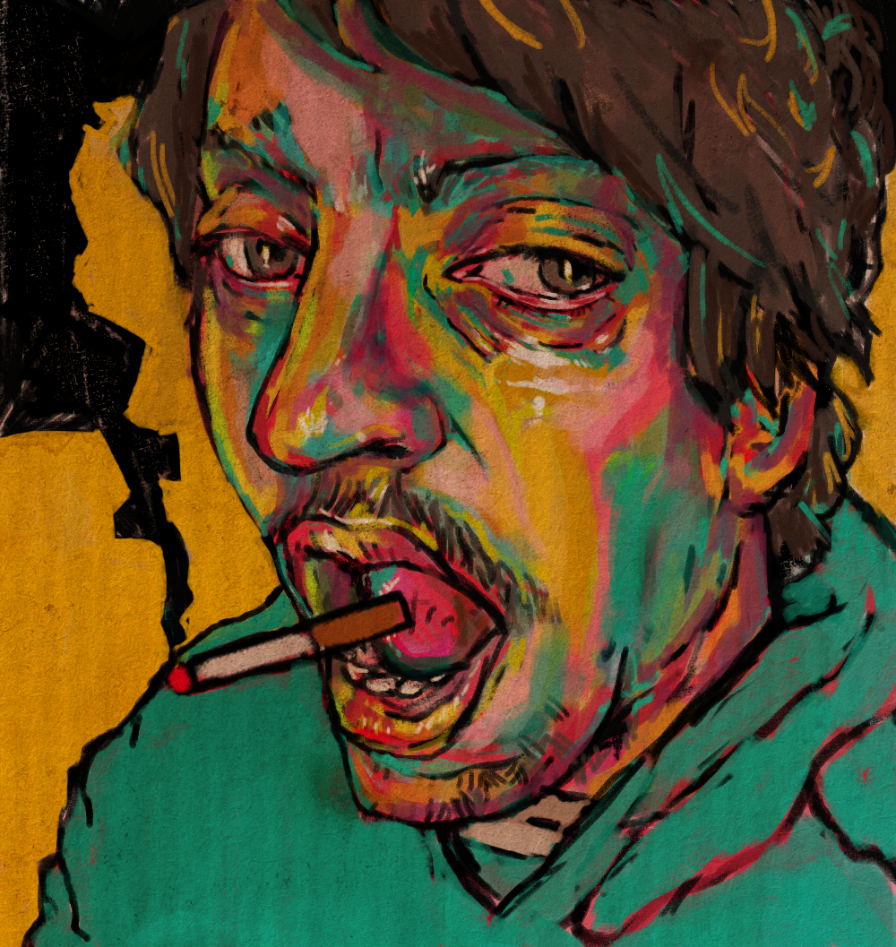
Stage 2
Running out of steam typing all of this up, so I'll keep this short.
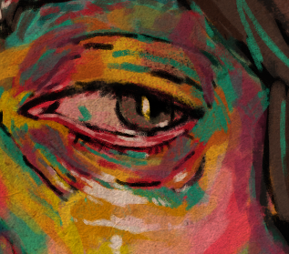
I just went in and added better definition. I tend to focus on my eyes and nose a lot whenever I'm stuck on a self-portrait, so I went for those first, or at least my left eye (viewer's right) and my nose.
While working on the eye, I (hehe funny rhyme) struggled denoting any moisture/tears on my skin until I eventually went for a true, #FFFFFF white. The water stain texture adds a sepia-tone to everything so it doesn't pop as much, but it work for what I intended. After that, I went through and added white highlights elsewhere.
It was looking a lot better but something was still off. I thought that the red background, red hoodie, and red skintones was too much warmth so I went in and colored the hoodie blue.
I really like injecting symmetry somewhere in my artworks, especially as they get more chaotic. It has a holistic effect that makes all the disparate parts cohesive. Given that the hoodie was blue and my face was predominantly red/pink, I started blocking yellow into the background and ended up loving it.
Something driving me crazy is how the cherry of the cigarette and smoke all intersect at one point with my shoulder. It creates a weird nexus and lots of shapes/triangles. It will be the first thing I fix when I jump back into this.
Reflection
And that's where I've left off. I don't have much to say about this one, other than I'm really stoked to get back into the habit of making art. Seeing this color scheme come together made me really nostalgic for my old art-making days. Tapping into this side of myself has been really affirming for me. I'm excited to see where things go from here.
I want to keep working on this, but I'm at a good stopping point now, so I'll probably let it marinate for a bit before I get back into it. Stage 3 will mostly be finetuning things and adding more midtones, so nothing exciting. I wish I would have recorded the earlier parts of this, especially Stage 2 where every move wildly changes the piece. Hopefully I'll remember to record my screen for my next piece.
Until then, I'll see ya later. Thanks for reading and taking interest in my art.
Full Size
Details
✘ Posted on — 03/06/25
✘ Last modified — 6 months, 2 weeks ago
✘ Link — https://blog.xavierhm.com/smoke-break-self-portrait-wip-stages-0-2
Footnotes
In any case, I think any good work of art blurs the lines between painting and drawing.↩
One of the reasons I've really taken to digital art is that you can preserve different layers of your art work and non-destructively flip between each stage of a drawing/painting. Back when I did traditional art I would take sooooo many progress pictures. I really, really love seeing how a piece develops over time.↩
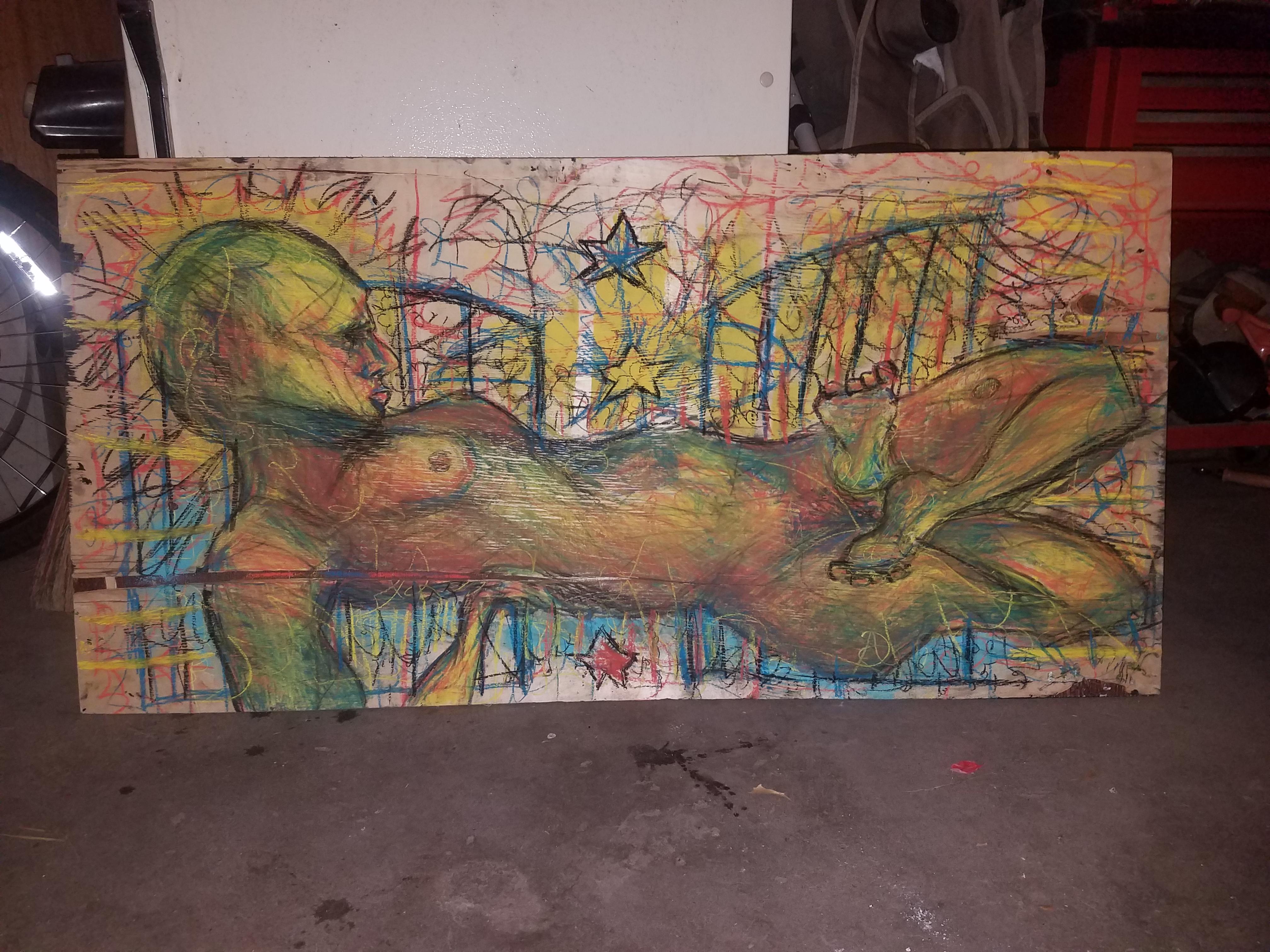
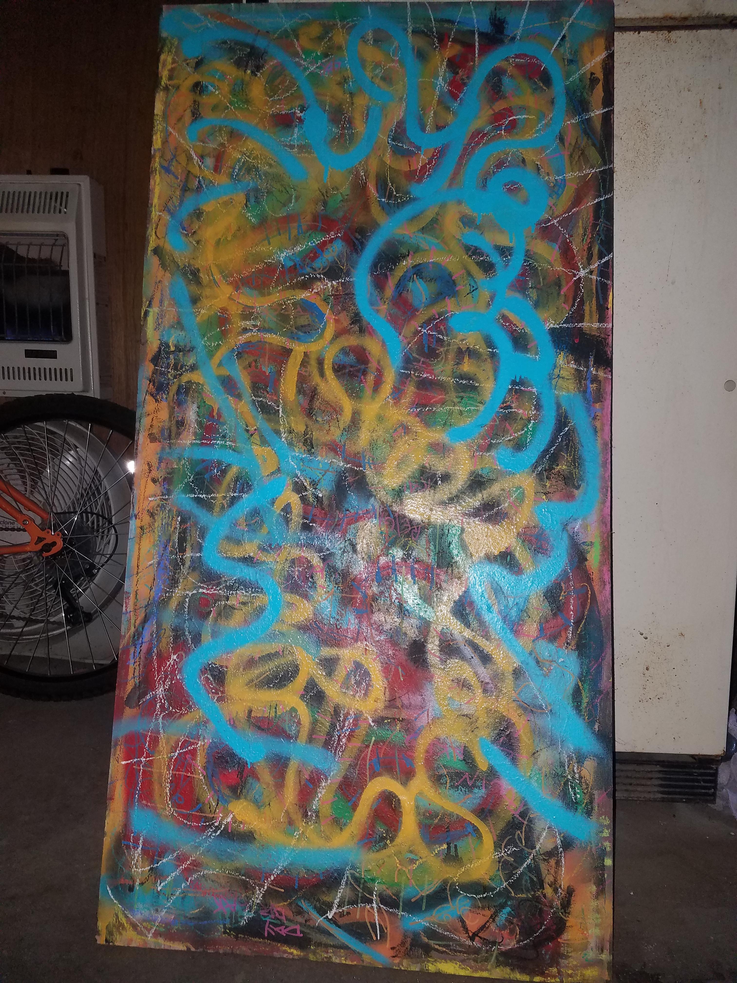
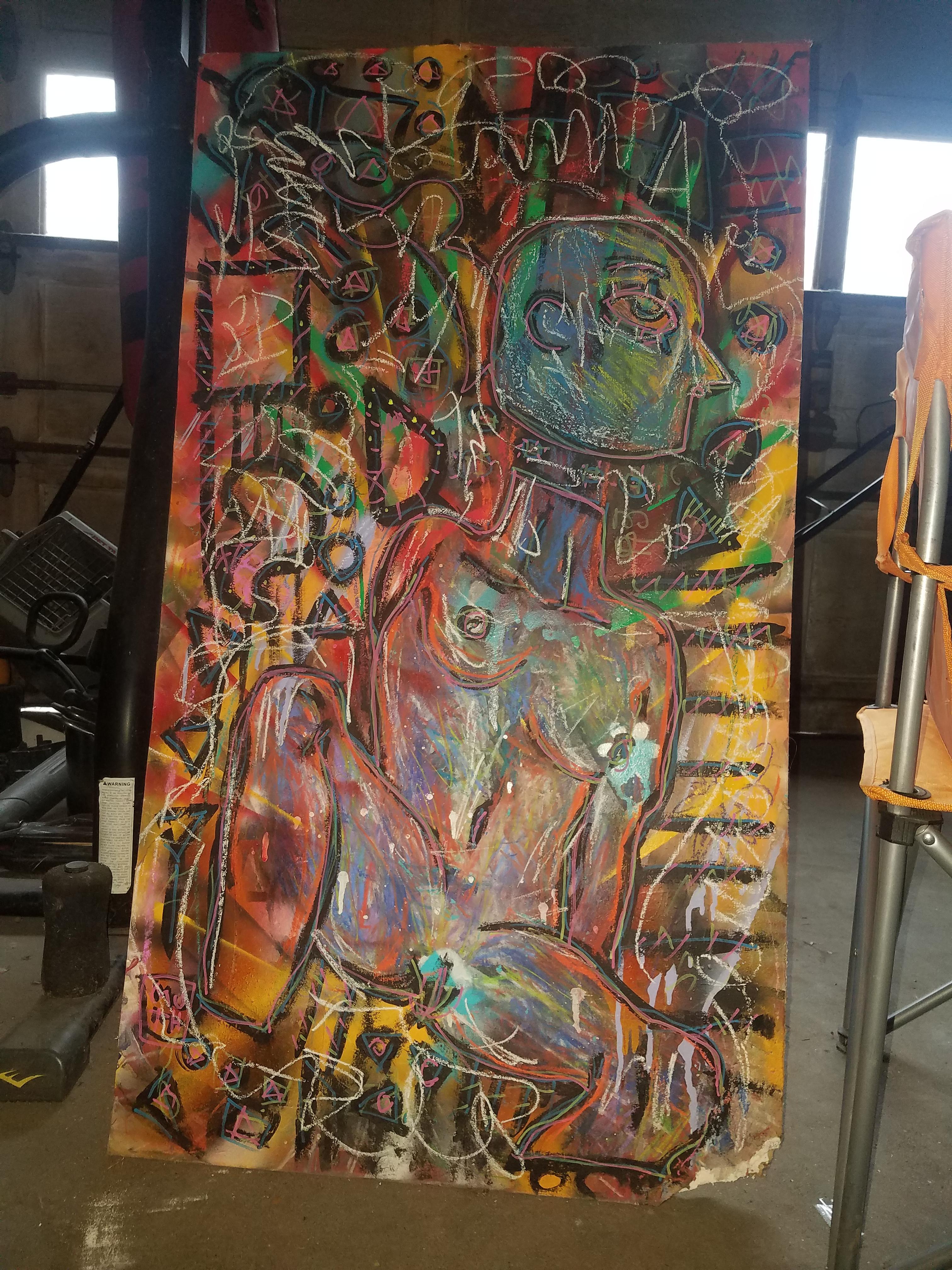
Here are examples of some old artwork I did in my mom's garage when I was 18: this figure on a piece of scrap plywood, the abstraction on the reverse side, and this figure on a slab of drywall (I was really big on mixing Egyptian-esque and Greek-esque figurative motifs for a minute). (Not pictured: a dirty bong, full ashtray, and one and a half packs of Marlboro Reds.)↩
By graphic, I mean flat colors and tones, not a lot of blending, and heavy-handed marks; whenever I work in this style I also use "colors as value", wherein a warm-to-cold temperature gradient substitutes the light-to-dark paradigm. For example, instead of using a light color for a highlight in this piece, I instead went for really bright, neon yellows; likewise, I used teal for shadows. This style is just light tones and dark tones on top of one another, and not a lot of mid-tones (except where the light and dark tones intersect, I guess)↩
I started using the Brush Preset History docker and it's amazing for jumping between brushes.↩
I don't know if visual documentation of emotional moments is a me thing or an artist thing. As someone who primarily exercises with self-portraits, I've done this since I was young. One of my biggest inspirations as far as using yourself as a subject is the great Cindy Sherman.↩
CMY is cyan, magenta, yellow; as opposed to RGB, which is red, blue, green. They are two different types of color schemes used for graphic design and digital printing. It's really just technical stuff about how inks work and all that. Using them to compare bright colors versus traditional colors is just a me thing.↩